




When should you rebrand?

A rebrand is the process of changing or renewing a brand’s identity: its name, logo, colors, messaging or even its positioning, so that it once again represents what the company is today. It makes sense when the brand looks outdated, when the business has changed or when it no longer connects with its customers.
Key takeaways
- A rebrand can be partial (updating the logo and visual identity) or total (changing the name, strategy and positioning).
- The clearest signs: the brand no longer reflects the business, it looks dated, you changed audience or market, or there was a merger.
- A rebrand without strategy is just a logo change: first define what you want people to think of you.
- Real example: Organic Point became Ammora through a complete rebrand of its name and identity.
What is rebranding?
Rebranding literally means “making the brand again”. It is a strategy to change how people perceive a company. It is not just about a new logo: a good rebrand reviews the brand strategy, the message and the experience, and then translates those changes into the visual identity.
If you are still unsure about the difference between brand, logo and branding, we explain it in what is a brand.
Types of rebranding: refresh, partial and total
Not every brand change is the same. These are the three most common levels:
| Type | What changes | When it makes sense | Example |
|---|---|---|---|
| Refresh | Light visual tweaks: typography, colors or a simplified logo | The brand works but looks dated | Mastercard (2016) |
| Partial rebrand | Visual identity and part of the message; name and positioning stay | The business evolved and the image fell behind | Instagram (2016) |
| Total rebrand | Name, positioning, strategy and identity | A change of direction, a merger or a name that limits growth | Organic Point → Ammora |
When should you rebrand? 7 clear signs
1. Your brand no longer represents your company
You grew, changed your services or your values, but the brand still tells the story of when you started. If your team describes the business in different ways, the brand needs an update.
2. Your image looks outdated
Design trends and the way brands communicate change. An outdated identity suggests the company is outdated too, even if your service is excellent.
3. You changed audience or are entering new markets
If you now target a different kind of customer, another country or another price segment, your brand has to speak to that new audience.
4. You don’t stand out from the competition
If your brand looks like your competitors’, customers have no reason to remember you or choose you.
5. Your name causes problems
A name that is hard to pronounce, limits your growth or can’t be registered as a trademark is a strong reason to consider a new name (naming).
6. There was a merger, acquisition or change of ownership
When two companies join, a rebrand helps the market perceive the new organization consistently.
7. Your reputation needs a fresh start
After a crisis, a rebrand can support a real change in the company. But changing the image without changing what is behind it does not work.
Do you recognize two or more of these signs? In a free consultation we review your brand with you and tell you whether a refresh is enough or you need a full rebrand.
Online quote · free
Get your branding quote
Answer a few questions and tell us about your project. We reply with a proposal, timeline and price.
What would you like a quote for?
Prefer to talk? WhatsAppWhen NOT to rebrand
- When you are just tired of your logo, but your customers recognize and value it.
- When the real problem is the product, the price or customer service.
- When you don’t have the budget to roll out the new brand across all touchpoints (website, social media, store, stationery).
Rebranding is not a magic fix. Before deciding, it is worth running a brand audit to confirm it is what your business needs.
Rebranding examples
These are some of the best-known rebranding examples, along with two of our own projects in Lima:
| Brand | Year | What changed | Why |
|---|---|---|---|
| KFC | 1991 | Name: from Kentucky Fried Chicken to KFC | A shorter, more modern name, less tied to “fried” |
| Coca-Cola | 2016 | “One Brand” strategy: all variants under a single identity | Unify the brand without touching the logo |
| 2016 | Icon and color palette | Keep up with the app’s evolution | |
| Dunkin’ | 2019 | Name: dropped “Donuts” | Reflect its focus on coffee and drinks |
| Mastercard | 2016 and 2019 | Simplified logo, later without the name | A symbol that works on small screens |
| Burger King | 2021 | Retro-inspired logo, typography and packaging | Convey more authentic, appetizing food |
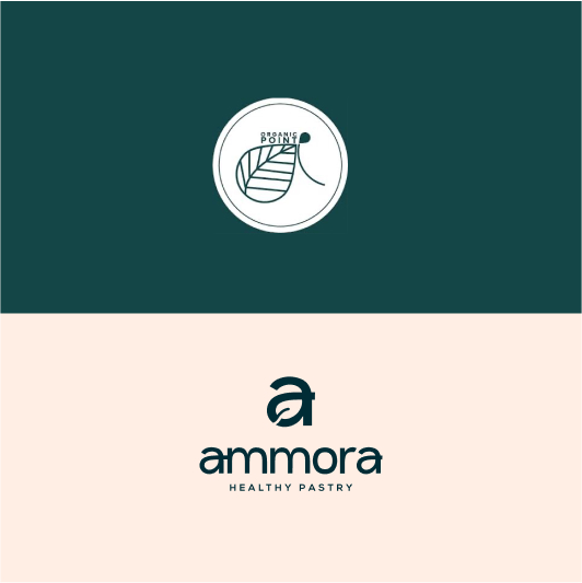
| Organic Point → Ammora | Macsen project | Name and full identity | A brand that matches its growth |
Organic Point → Ammora (Macsen project)
Organic Point, a bakery in Lima, needed a brand that better reflected its offer and its growth. We carried out a complete rebrand: a new name, Ammora, a new visual identity and applications for social media and packaging. See more projects in our portfolio.
Freight Logistic (Macsen project)
For this logistics company we completely renewed the logo, inspired by its line of business, so its image would convey the reliability and reach of its service.
KFC (1991)
Kentucky Fried Chicken became KFC. It is one of the most cited name changes: the brand gained a short, memorable name and moved the word “fried” out of the spotlight at a time when consumers were starting to look for lighter options.
Coca-Cola (2016)
Coca-Cola launched its “One Brand” strategy: instead of treating Coca-Cola, Diet Coke/Coca-Cola Light or Zero as separate brands, it united them under one identity with the red disc as the common element. It shows that a rebrand can be strategic without changing the logo.
Instagram (2016)
Instagram replaced its retro camera icon with a simplified symbol and a color gradient. The change was criticized at first, but it matched the app’s evolution into a much broader platform.
Burger King (2021)
Burger King brought back a logo inspired by its 1970s and 1980s version, with a warmer, more appetizing look and a new typeface. A rebrand that looks to the past to reinforce authenticity.
Airbnb (2014)
Airbnb moved from a wordmark to its own symbol, the “Bélo”, to express its idea of belonging. The rebrand supported its global expansion and its new positioning.
Dunkin’ (2019)
Dunkin’ Donuts dropped “Donuts” from its name to show it was no longer just a donut shop but a brand focused on coffee and drinks. It kept its orange and pink colors, so customers still recognized it.
Mastercard (2016 and 2019)
Mastercard simplified its two circles in 2016 and, in 2019, started using the symbol without the name. It could only do that because its logo was already widely recognized: a good example of a gradual refresh.
Rebrands that went wrong (and what to learn)
- Gap (2010): it replaced its classic blue-box logo with a generic one. The backlash was so strong that it went back to the old logo in less than a week. Lesson: don’t change what customers value without understanding why they value it.
- Tropicana (2009): it redesigned its US cartons and lost the orange-with-a-straw image that was its signature. Many customers couldn’t find the product on the shelf, sales fell and the brand returned to the old design. Lesson: identify your brand assets before touching them.
Both cases lacked the same thing: research before design. That is why our process always starts with an audit.
The rebranding process step by step
- Audit: analyze how customers, team and competitors perceive you today.
- Strategy: define purpose, positioning, value proposition and personality.
- Verbal identity: review name, tone of voice, tagline and key messages.
- Visual identity: design the new logo, colors, typography and applications.
- Brand guidelines: document everything so it is applied consistently.
- Launch: communicate the change to customers and team, and update website, social media and points of sale.
It is the same process we follow in our branding service.
How much does a rebrand cost?
It depends on the scope: a visual refresh costs much less than a total rebrand with a new name and strategy. As a reference, our packages start at US$350 (Essential Branding) and go up to US$1,500 including the website. See our services for details.
Rebranding FAQ
What is rebranding in a nutshell?
It is renewing a brand’s identity (name, logo, messaging or positioning) so it once again represents what the company is and connects better with its customers.
What is the difference between branding and rebranding?
Branding builds a brand from scratch: strategy, name and identity. Rebranding starts from an existing brand and renews it. That is why a rebrand begins by reviewing what works and what doesn’t before changing anything.
What is the most famous rebranding example?
Among the most cited are KFC (which stopped being called Kentucky Fried Chicken), Instagram (with its 2016 icon) and Dunkin’ (which dropped “Donuts” from its name). Gap is also famous for having to reverse its new logo.
How long does a rebrand take?
A partial rebrand can be ready in 2 to 3 weeks. A total one, with strategy, naming and full identity, usually takes 4 to 6 weeks, plus implementation time.
Will I lose customers if I rebrand?
Not if you communicate it well. Explaining why you are changing and keeping what customers value helps them come along. The risky part is changing without a strategy.
Do I need to register my trademark again?
If you change the name or the logo, it is wise to register the new trademark to protect your investment.
Does your brand need a change?
If you recognized any of these signs, we can help you decide whether you need a refresh or a full rebrand. Macsen is a branding agency in Lima, Peru: check our services or book a free consultation.